Module 6 Handling data
Select each tab to find out more or use the breadcrumb trail to go to another part of this resource.
Can I interpret sets of data with different sample sizes represented in pie charts?

Example review questions

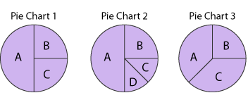
  • Some children were asked to choose their favourite drink from A, B, C or D. Pie charts 1 and 2 represent 32 children. Pie chart 3 represents 24.
    Three pie charts split into different segments.
  • John says drink B was chosen by the same number of children in each group. Explain why this cannot be true.
  • Choose two of the pie charts: Create two statements to compare and explain the data.
  • Can you write a statement based on these pie charts that isn't true for someone else to correct?
  • Imagine pie chart 1 still represents 32 children but pie chart 2 represents 128 children. Make statements to compare the two pie charts.

Teaching guidance

This teaching guidance document suggests some of the key vocabulary, models, images and practical equipment that children should experience and be able to use. It also includes some teaching tips to provide a few starting points for ways of supporting children with this area of mathematics.

PDF file Teaching guidance: Can I interpret sets of data with different sample sizes represented in pie charts? | 155KB new window

Consolidation and practice

These resources are to support children in guided or independent work. Roll over the highlighted resource for a description.

Data handling
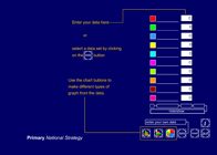
itp_data_handling.png

This interactive teaching program (ITP) is an ICT-based tool to support the exploration of data. Data handling ITP allows the child or teacher to enter data into a table and then create a vertical bar chart, a horizontal bar chart or a pie chart. The user can select from existing datasets, which can then be amended to show the impact and change on the charts, or they can enter collected data.

Opportunities to use and apply

Possible contexts include:

  • Science, e.g. Record the resting heart rates of the class using the Data Handling ITP and compare to this graph:
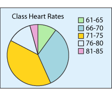
    Pie chart showing class heart rates. Green is sixty one to sixty five, blue is sixty six to seventy, yellow is seventy one to seventy five, white is seventy six to eighty and pink is eighty one to eighty five.
  • PSHE, e.g. A healthy diet consists of 15% fat, 17% protein and 68% carbohydrate. Ask children to keep a food diary for a day and create their own pie chart showing the ideal proportions.
  • Comparing data with similar data from other classes, for example, deciding in which class an author from a given list is more popular.
  • Real-life data, e.g. Compare proportions of people in different age ranges in a village and a city in geography; compare proportion of earnings spent in different ways in two different eras in history.
Confirming learning

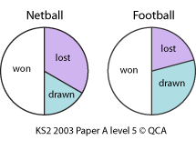
  • The pie charts show the results of a school's netball and football matches. The netball team played 30 games. The football team played 24 games.
    Two pie charts showing results of a school's netball and football matches.
    Estimate the percentage of games that the netball team lost.

    David says, 'The two teams won the same number of games'. What error might he have made? Make a valid statement based on the charts.
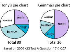
  • These pie charts show the creatures that Tony and Gemma have collected from their gardens. Who found more snails? Explain how you know.
    Pie charts for Tony and Gemma, showing how many creatures they have collected.