Module 6 Handling data
Select each tab to find out more or use the breadcrumb trail to go to another part of this resource.
Can I interpret and explain data presented in line graphs?

Example review questions

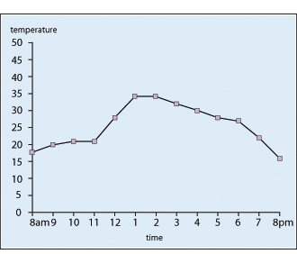
  • Explain what this graph tells us about the temperature over the course of 12 hours starting at 8 am.
    Graph showing temperature on the Y axis and hours on the X axis.
  • 'The temperature rose between 11 am and 1 pm faster than it fell between 6 and 8 pm'. Is this correct, and if so, how do we know?
  • Make up two further correct statements about the temperature during the time represented. Use the graph to justify these.
  • What might the graph look like for 12 hours on a winter's day? Sketch the graph and explain your thinking.

Teaching guidance

This teaching guidance document suggests some of the key vocabulary, models, images and practical equipment that children should experience and be able to use. It also includes some teaching tips to provide a few starting points for ways of supporting children with this area of mathematics.

PDF file Teaching guidance: Can I interpret and explain data presented in line graphs? | 112KB new window

Consolidation and practice

These resources are to support children in guided or independent work. Roll over the highlighted resource for a description.

Line graph
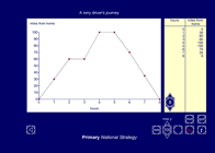
itp_line_graph.png

This interactive teaching program (ITP) is an ICT-based tool to support the exploration of handling data. Line graph ITP allows the child or teacher to enter data into a table or select from existing data sets and then create a line graph to represent the data. Data and values on axes can be changed to explore the impact on the graph.

Opportunities to use and apply

Possible contexts include:

  • Measures, e.g. Use conversion graphs to convert between units (e.g. £s/Euros, Miles/Km,).
  • Literacy, e.g. Represent the plot of a story/play in a graph (mood/level of danger).
  • Speaking and listening, e.g. Remove the line showing the final stages of a line graph. Ask children to explain and justify a suitable ending.
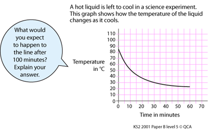
  • Science, e.g. cooling experiments.

Graph showing temperature in degrees centigrade on the Y axis and time in minutes on the X axis.

Confirming learning

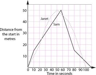
Jack gave a report on the swimming race shown in the graph but he has made a few mistakes. Explain why each statement is correct or incorrect.

  • They are about to swim 100 metres.
  • Sam stops after 40 metres.
  • Sam goes quickly into the lead.
  • After 28 seconds, Janet overtakes Sam.
  • Sam wins by 10 seconds.

What else could you add to Jack's report?
Graph showing distance from the start in metres on the Y axis and time in seconds on the X axis.