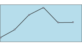
Example review questions
- What is this graph telling you?
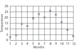
- What could the title be?
- Lucy said: ‘July, August and September are the hottest months.’ Was she right? Explain your reasoning.
- Which pairs of months had similar temperatures?
 Handling data
This teaching guidance document suggests some of the key vocabulary, models, images and practical equipment that children should experience and be able to use. It also includes some teaching tips to provide a few starting points for ways of supporting children with this area of mathematics.
![]() Can I explain what information a graph or chart is showing? - teaching guidance | 60KB
Can I explain what information a graph or chart is showing? - teaching guidance | 60KB 
These resources are to support children in guided or independent work. Roll over the highlighted resources for a description.
![]() How to use line graph ITP | 142KB
How to use line graph ITP | 142KB
![]() How to use data handling ITP | 156KB
How to use data handling ITP | 156KB
![]() Interpreting information in graphs and charts example questions | 80KB
Interpreting information in graphs and charts example questions | 80KB
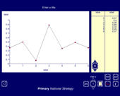
This interactive teaching program (ITP) is an ICT-based tool to support the exploration of handling data. Line graph ITP allows the child or teacher to enter data into a table or select from existing data sets and then create a line graph to represent the data. Data and values on axes can be changed to explore the impact on the graph.
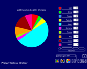
This interactive teaching program (ITP) is an ICT-based tool to support the exploration of data. Data handling ITP allows the child or teacher to enter data into a table and then create a vertical bar chart, a horizontal bar chart or a pie chart. The user can select from existing datasets, which can then be amended to show the impact and change on the charts, or they can enter collected data.
Possible contexts include:
Ask probing questions such as: