Module 6 Handling data
Select each tab to find out more or use the breadcrumb trail to go to another part of this resource.
Can I interpret what the sectors in a pie chart represent?

Example review questions

A pie chart to display a group of children's favourite fruit. 50 percent bananas. The remaining 50 percent is split evenly between oranges, apples and grapes.
  • A group of children chose their favourite fruits from bananas, oranges, apples and grapes. 15 of them chose bananas. How many chose apples? How do you know?
  • How many children were interviewed altogether? Explain your thinking.
 

Teaching guidance

This teaching guidance document suggests some of the key vocabulary, models, images and practical equipment that children should experience and be able to use. It also includes some teaching tips to provide a few starting points for ways of supporting children with this area of mathematics.

PDF file Can I interpret what the sectors in a pie chart represent? - teaching guidance | 55KB new window

Consolidation and practice

These resources are to support children in guided or independent work. Roll over the highlighted resource for a description.

Data handling

itp_data_handling.png

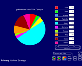
This interactive teaching program (ITP) is an ICT-based tool to support the exploration of data. Data handling ITP allows the child or teacher to enter data into a table and then create a vertical bar chart, a horizontal bar chart or a pie chart. The user can select from existing datasets, which can then be amended to show the impact and change on the charts, or they can enter collected data.

Opportunities to use and apply

Possible contexts include:

  • collecting examples of pie charts representing data related to cross-curricular work and children’s interests, e.g. from newspapers, magazines and the internet;
  • using spreadsheet programs to create pie charts, setting questions for other children to answer.
 

Confirming learning

Ask probing questions such as:

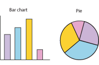
  • Do you think this bar chart and pie chart represent the same set of data? Explain your answer.
    A bar chart and a pie chart.
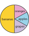
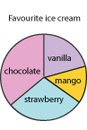
  • This pie chart represents the data collected from 100 adults. What conclusions can you draw from the pie chart? Explain your thinking.
    A pie chart showing a group of adults favourite ice cream. Approximately 30 percent chose chocolate, approximately 30 percent chose strawberry, approximately 15 percent chose mango and approximately 25 percent chose vanilla.