Example review questions
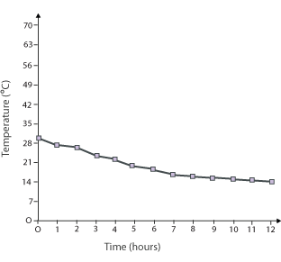
The graph shows the results of a science experiment involving measuring temperature over time.
- What was the temperature at the beginning of the experiment? How do you know?
- How long had the experiment been going when the temperature was 20 degrees?
- What was the temperature after 8 hours?
- How could you annotate the graph to help you answer these questions?
Consolidation and practice
These resources are to support children in guided or independent work. Roll over the highlighted resources for a description.
Line graph
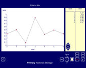
This interactive teaching program (ITP) is an ICT-based tool to support the exploration of handling data. Line graph ITP allows the child or teacher to enter data into a table or select from existing data sets and then create a line graph to represent the data. Data and values on axes can be changed to explore the impact on the graph.
Data handling
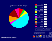
This interactive teaching program (ITP) is an ICT-based tool to support the exploration of data. Data handling ITP allows the child or teacher to enter data into a table and then create a vertical bar chart, a horizontal bar chart or a pie chart. The user can select from existing datasets, which can then be amended to show the impact and change on the charts, or they can enter collected data.
Opportunities to use and apply
Possible contexts include:
- reading graphs and charts in all other curricular areas, e.g. results from data loggers in science, secondary sources of data in history and geography;
- applying understanding through labelling axes of different completed graphs, using given information, e.g. giving children several facts about results shown on a graph that enable them to work out and label the scale.
Confirming learning
Use suitable graphs and ask probing questions such as:
- What information do you need in order to be able to work out what the unlabelled divisions on this axis represent?
- What would be sensible divisions to use for this set of data?
- What advice would you give someone trying to work out what this section of the bar chart represents?
 Handling data