Example review questions
These pie charts show the results of a school’s netball and football matches. The netball team played 30 games. The football team played 24 games.
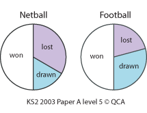
- David says: ‘The two teams won the same number of games.’ Is he correct? Explain how you know.
- What other conclusions can be drawn from the pie charts?
Teaching guidance
This teaching guidance document suggests some of the key vocabulary, models, images and practical equipment that children should experience and be able to use. It also includes some teaching tips to provide a few starting points for ways of supporting children with this area of mathematics.
 Can I draw a conclusion from a graph or chart? - teaching guidance | 35KB
Consolidation and practice
These resources are to support children in guided or independent work. Roll over the highlighted resources for a description.
Line graph
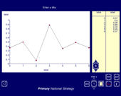
This interactive teaching program (ITP) is an ICT-based tool to support the exploration of handling data. Line graph ITP allows the child or teacher to enter data into a table or select from existing data sets and then create a line graph to represent the data. Data and values on axes can be changed to explore the impact on the graph.
Data handling
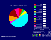
This interactive teaching program (ITP) is an ICT-based tool to support the exploration of data. Data handling ITP allows the child or teacher to enter data into a table and then create a vertical bar chart, a horizontal bar chart or a pie chart. The user can select from existing datasets, which can then be amended to show the impact and change on the charts, or they can enter collected data.
Opportunities to use and apply
Possible contexts include:
- drawing conclusions from graphs within science settings, e.g. deciding which is the most effective thermal insulator; comparing translucency of different materials, using light sensors or variations in temperatures in different locations in the school or classroom;
- writing a climate report for different locations around the world, drawing on a range of information, e.g. internet sites and holiday brochures;
- interpreting graphs and charts presented in the media and on the internet, e.g. those relating to topical issues such as eating habits.
Confirming learning
Ask probing questions such as:
- What do you notice about the way this data is organised?
- State three conclusions you can draw from the information in this graph.
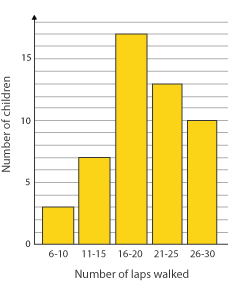
- Could you represent on this graph a child who walked four laps? What would you need to change?
 Handling data